How I designed a Cross-Platform UX that Helped 10K+ Kids Learn Music—with Support from Parents and Teachers
Project published as a design case in the International Journal of Designs for Learning, June 2025
Details
The Music Place
Client
UX Researcher & Designer (Solo)
Role
2024
Year
Parents and kids with limited music theory knowledge struggled to engage with at-home practice. I redesigned a cross-platform UX/UI ecosystem grounded in the Orff concept to streamline task flows, improve accessibility, and integrate gamification to drive motivation and usability.
Overview
TL;DR
Problem
Parents with kids in music classes often struggle to support their child's learning because they can't read or understand music.
What I did
Designed intuitive tools and interactive guides to help parents engage in their child's practice without requiring music knowledge.
Context
60% of parents find it challenging to support their children's music practice due to a lack of musical knowledge.
(Merriam Music).
Desk Research Insights
70% of young music students face frustration due to poor practice environments, increasing dropout rates.
85% of students showed higher engagement with gamified learning.
50%+ of students who don’t practice during school breaks lose interest, reducing retention.
67% of primary students preferred gamified methods for a more engaging and interactive experience .
Primary Research Insights
Parent and Teacher Interviews
Children struggle with musical concepts,
leading to frustration and disengagement.
It is difficult to reinforce learning at home,
Parents of young children (3-7).
Teachers struggle to maintain engagement,
while parents struggle in tracking progress.
Current Tools in the Market: Strengths & Gaps
Simply Piano by JoyTunes
Best Features: Interactive piano lessons, technology integration, parental progress tracking.
Lacks: Diversity in instrument offerings, limited customization for learning paths.
Yousician
Best Features: Comprehensive curriculum for various instruments, parental progress tracking.
Lacks: Subscription model creates financial barriers, complex interface for younger kids.
Current Experience Parents and Kids are having
Problem Statement
How can we make music learning fun for kids 3-7 while connecting school and home practice?
Who has this problem?
Parents
Busy parents of young music learners (3-7) struggle to support practice without a music background.
They need simple, engaging tools that help kids practice independently, stay motivated, and progress.
Solution ecosystem
Practice lessons on the Kids' iPad UI
Track progress via the Parents' Mobile App
Enable teachers to customize content through the Web Interface.
Lesson Personalization Strategy
Instrument First
Pick an instrument, and basic lessons follow.
Non-exhaustive approach providing recommendations from teachers.
Class-wise
Pre and post-class, pre-drafted modules.
Structure includes warm-up, sing-along, play-along, and story time.
Pre-drafted
A pre-set, module-based learning system.
Options for lessons, games, and activities with rewards for success.
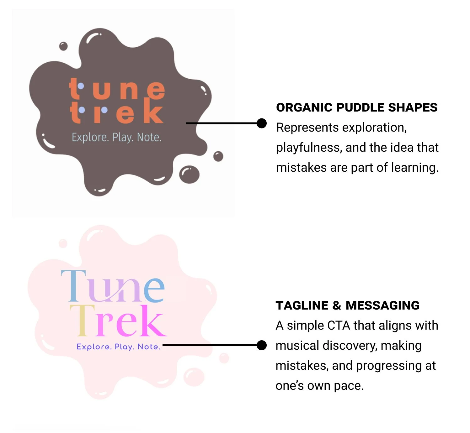
Branding
The color scheme is designed to create a playful and inviting environment for children aged 3-7.
Tune Trek Solution Ecosystem:
1. iPad UI for Kids
Challenges Addressed:
Motivating children to practice
Providing personalized lessons
Making learning fun and interactive
STEP 2: Using the App
Interactive Lessons with animated guidance.
Games & Activities to reinforce music theory concepts.
Characters suggest practice lessons and activities based on personalized teacher recommendations.
How gamification and reward system help?
Studies show gamified learning can increase engagement by 48% and improve student performance by 34% (Wikipedia).
Reward systems boost motivation by offering incentives like badges, reinforcing positive behavior.
STEP 1: Onboarding
Children begin by selecting a character to guide them through the app.
The chosen Character provides animated, voice-guided directions to help navigate the platform.
Why is Avatar Selection Helpful?
Choosing avatars in educational apps can increase student engagement by 65%, making learning more personalized and enjoyable (EdTech Magazine).
2. Teachers Dashboard
(under development)
Upload Pre-Drafted Lessons: Teachers can upload lessons, games, and stories personalized to each student's progress and preferences, that students then access via their iPads.
Weekly Course Schedule: Visual representation of classes ensures easy planning and management.
Clear Progress Tracking: Monitor lesson completion and student engagement.
3. Parents' App
Challenges Addressed:
Balancing encouragement and progress tracking
Understanding children's practice needs
Features:
Real-time progress tracking
Lesson customization
Communication with teachers
Screen time and engagement controls
Parents' Mobile App Overview
Onboarding
Dashboard Setup:
Create a parent profile and link it to child's account.
Tutorial & Preferences:
Set notification preferences and explore the app's features via a guided tutorial.
Accessing Lesson Plans & More
Lesson Plans:
Review pre-drafted lesson plans tailored to child's progress.
Communicate with Teachers:
In-app messaging allows direct communication with teachers.
Adjust Learning Goals:
Customizable learning paths, setting goals, and access detailed progress reports.
What Users said
(Unmoderated User Testing)
“I'd like more robust parental controls to monitor and limit screen time effectively.”
— Marc (Parent)
“Kids are excited about choosing their own teachers, and the vibrant visuals keep them fully engaged.”
— Sky (Music Teacher)
“I liked the animation and colors .”
— Vivaan (7 year old)
Tune Trek: Success Metrics
Prototype Testing (Unmoderated) @ Music Place, Sunnyvale, CA
Practice consistency improvement
40% ▲
Parental engagement increase
60% ▲
User drop-off rate reduction
20% ▼
Reflections
In music education, engagement isn’t a bonus, it’s essential.
Effective learning happens when kids feel motivated, and parents can support practice effortlessly, no music background required.
🎯 Designing for Dual Users
Balancing usability for both children and parents required simplifying complex interactions while ensuring accessibility for varying tech literacy levels.
🎮 Gamification & Motivation
Integrating gamified elements proved essential in sustaining engagement, making learning feel more like play while supporting independent practice.


