Details
Marketeq Digital
Client
UX Researcher & Designer owing
End-to-end payout experience . Transaction transparency system . Trust & confirmation patterns
Role
Timeline
Q2 2025 (March 2025 to June 2025)
Product management · Engineering · Data science
Collaborators
Due to product confidentiality, certain data, metrics, and implementation details have been simplified or anonymized.
The design approach and system thinking reflect the real project work.
💌 Get in touch to learn more.

What is Marketeq Projects?
Most platforms pay easily but withdraw poorly. Marketeq Projects bridges that gap, a remote marketplace linking 84K+ freelancers and agencies across 7 regions.
Background
The Users


Why Payouts matter?
Launching globally, payouts were critical to scale
Freelancers wanted both auto-payouts and instant withdrawals
The Problem
58% of freelancers on our platform faced payout issues
“I never know if pending = available.
I don’t want to press Withdraw and risk losing money.” - Freelancer

What users needed
Available vs pending funds
Processing vs scheduled payouts
Fees, holds, and thresholds
Exact arrival timing
Challenges
User Challenge
Freelancers lacked clarity on fees, timing, and payout status, making withdrawals feel risky and unreliable.
Engineering Challenge
Scalable payouts across 7 regions, API/ops limits, fewer support tickets.
Business Challenge
The platform needed to manage risk, reserves, and global scale while reducing support load and maintaining trust.
Research
Phase 1 — Competitive + best-in-class audit
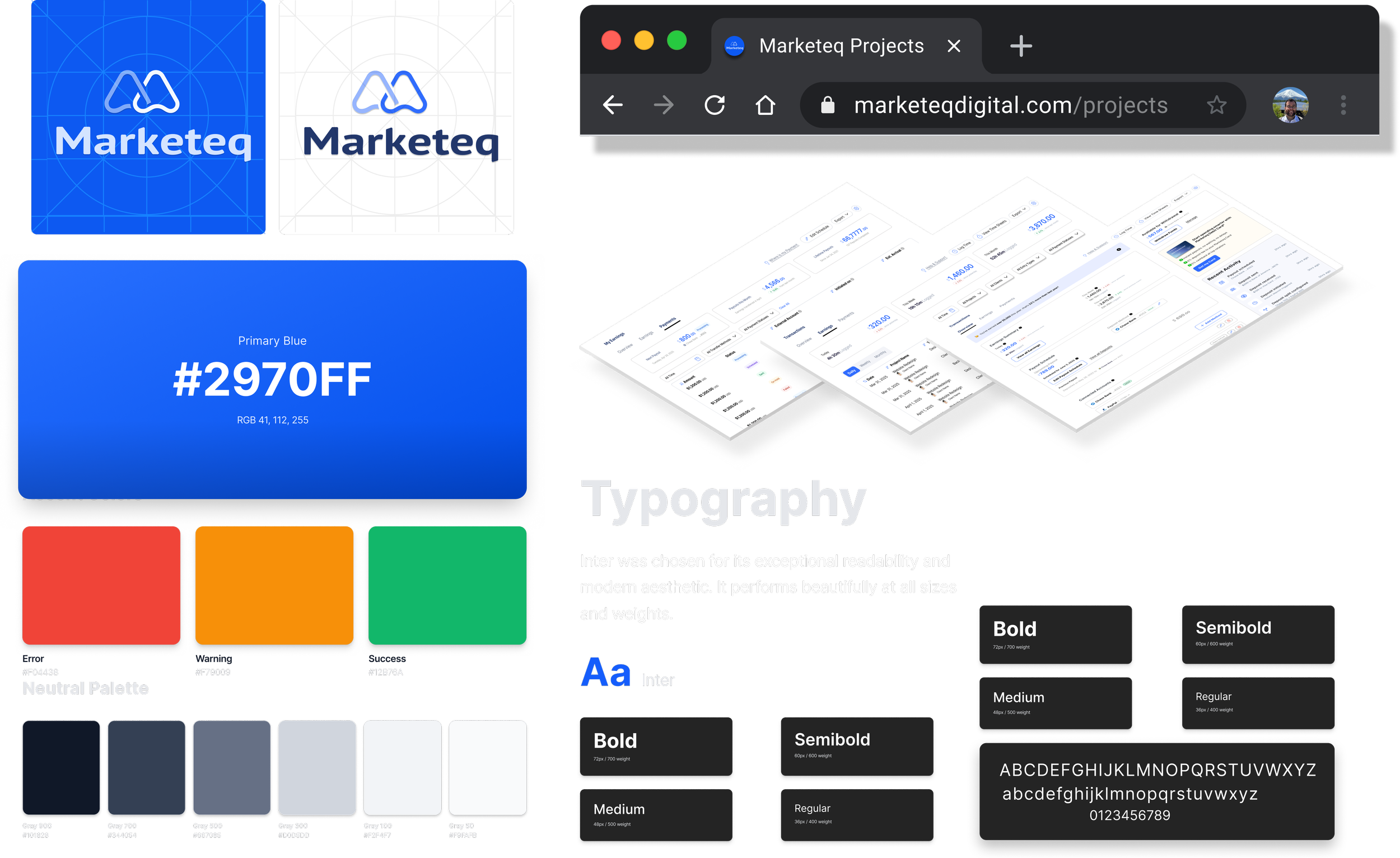
I benchmarked design systems on 20+ platforms to reuse familiar UX patterns, skipping low-fidelity exploration and moving straight to high-fidelity, pattern-aligned wireframes.
Key takeaways:
Klarna’s early fee disclosure
Amazon’s confirmation/progress patterns
Stripe’s clear status indicators.
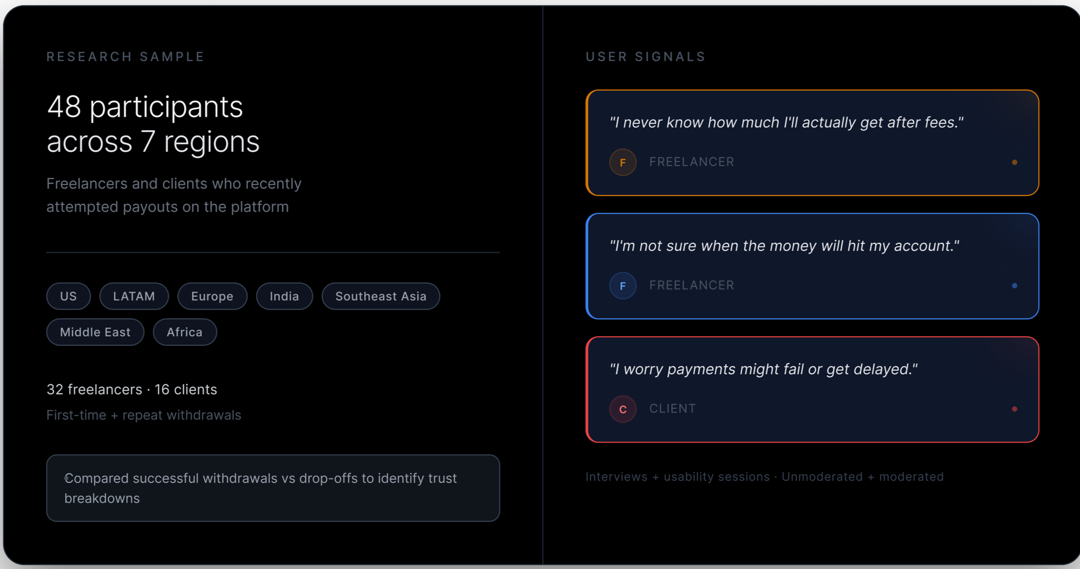
We ran three phases of research, in sequence, each one building on the last.
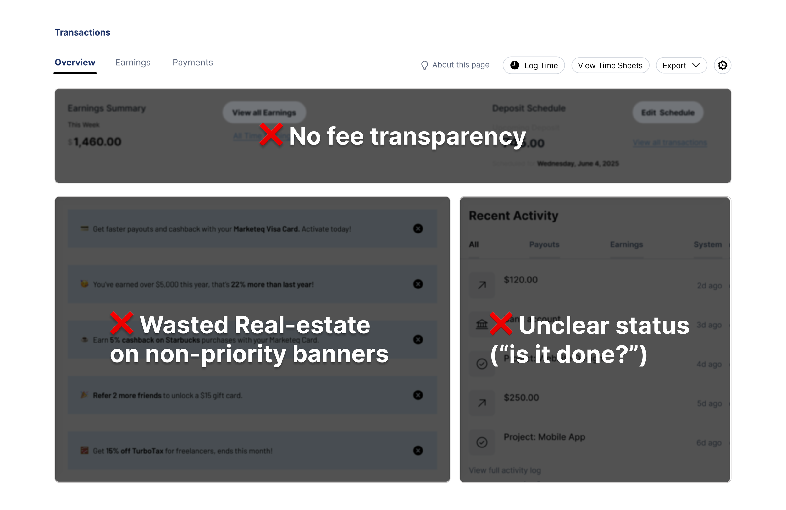
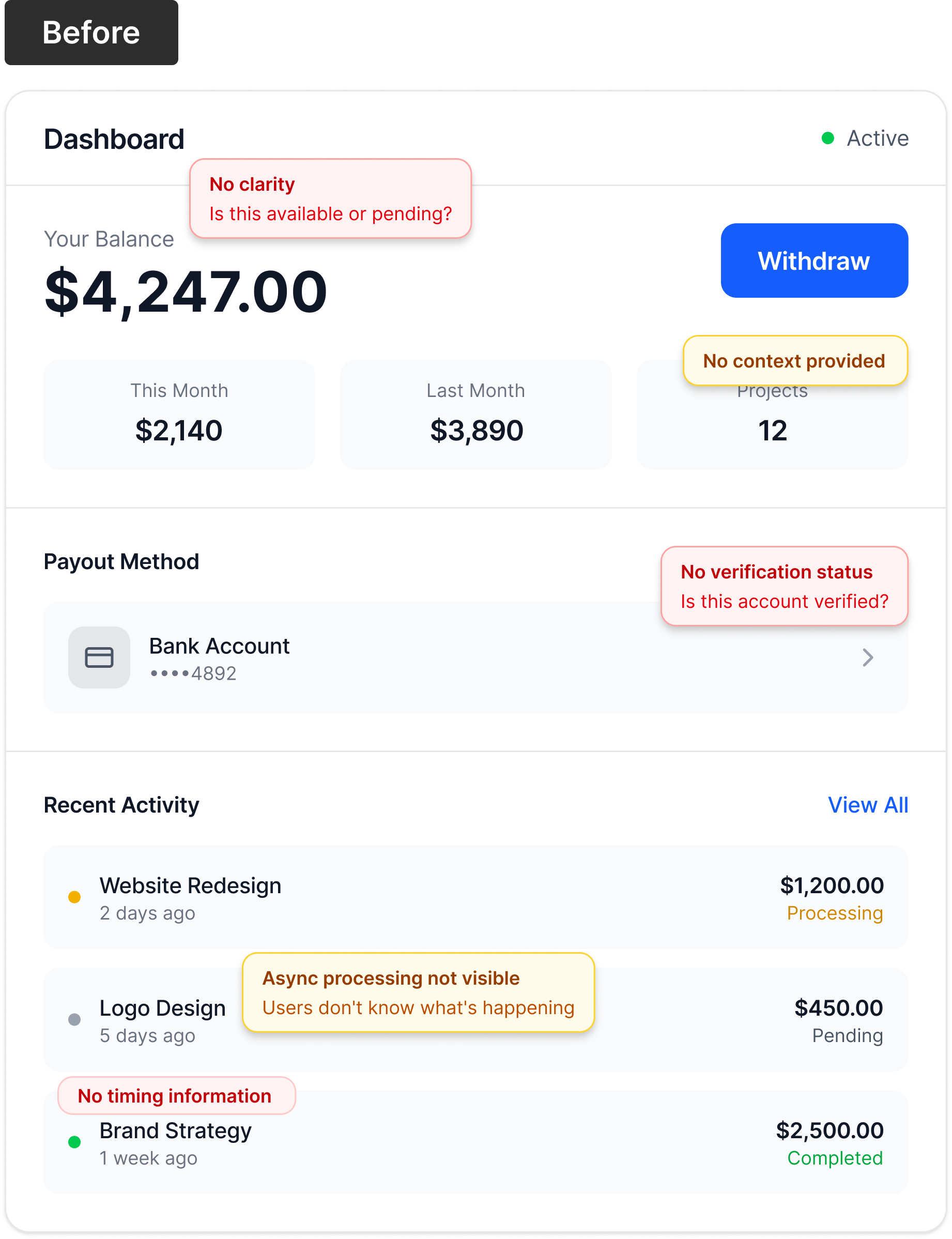
Phase 2 — Current experience audit
We traced the entire withdrawal process to find where trust failed.
The steps looked simple: project done → payment → processing → available balance → withdraw.
But users hit friction at every step:
"Available" wasn’t clear.
Fees showed up only at confirmation.
No explanation for the gap between total earnings and withdrawable balance.
No timing info after withdrawal.
Users were confused by unclear information.
Phase 3 - User research
Problem Statement
How might we remove the trust gap at Withdrawals?
The Solution
System Architecture - From earnings to delivery · Mapping money movement, user decisions, and trust gaps
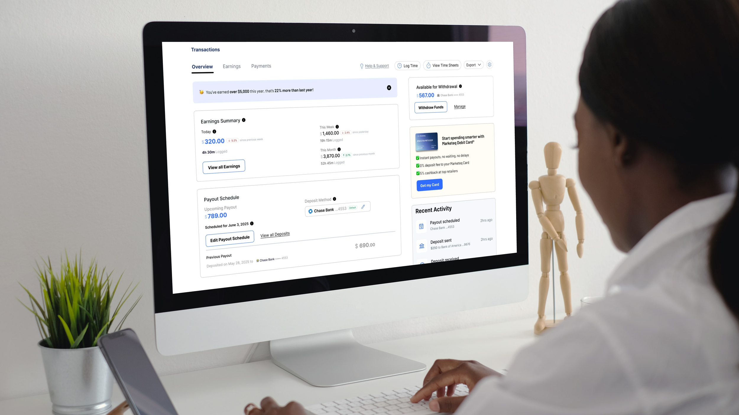
I simplified the finances for clarity and trust: clear balances, confident payout setup, and fast, worry-free actions.
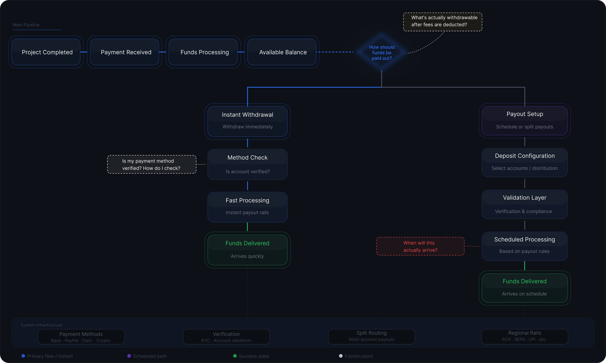
Instant withdrawal
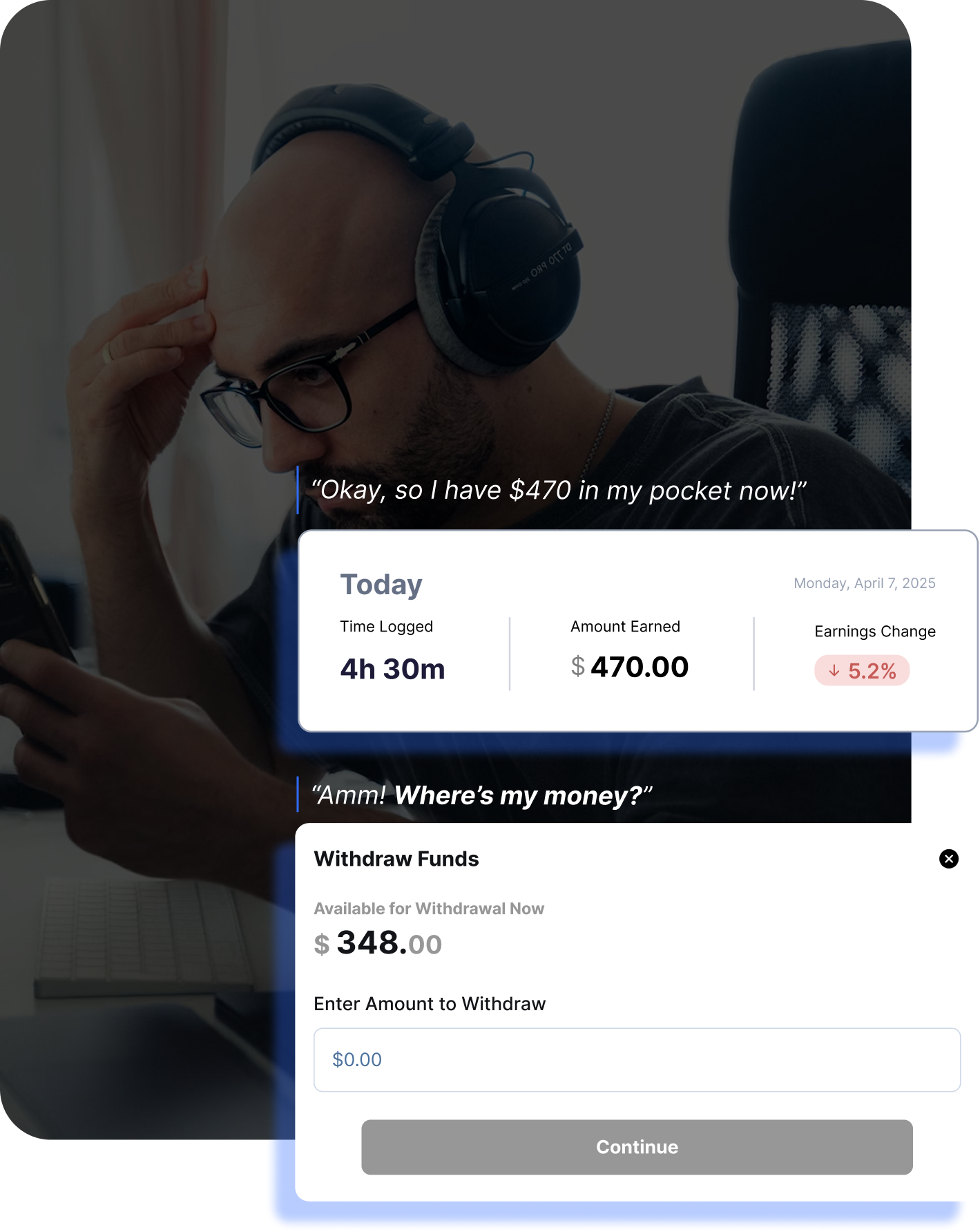
The most stressful moment in the flow. Users saw a single number and couldn’t tell what it meant. The redesign made the withdrawal screen explain everything up front.
Design Decision 1 - Redesigning the withdrawal screen
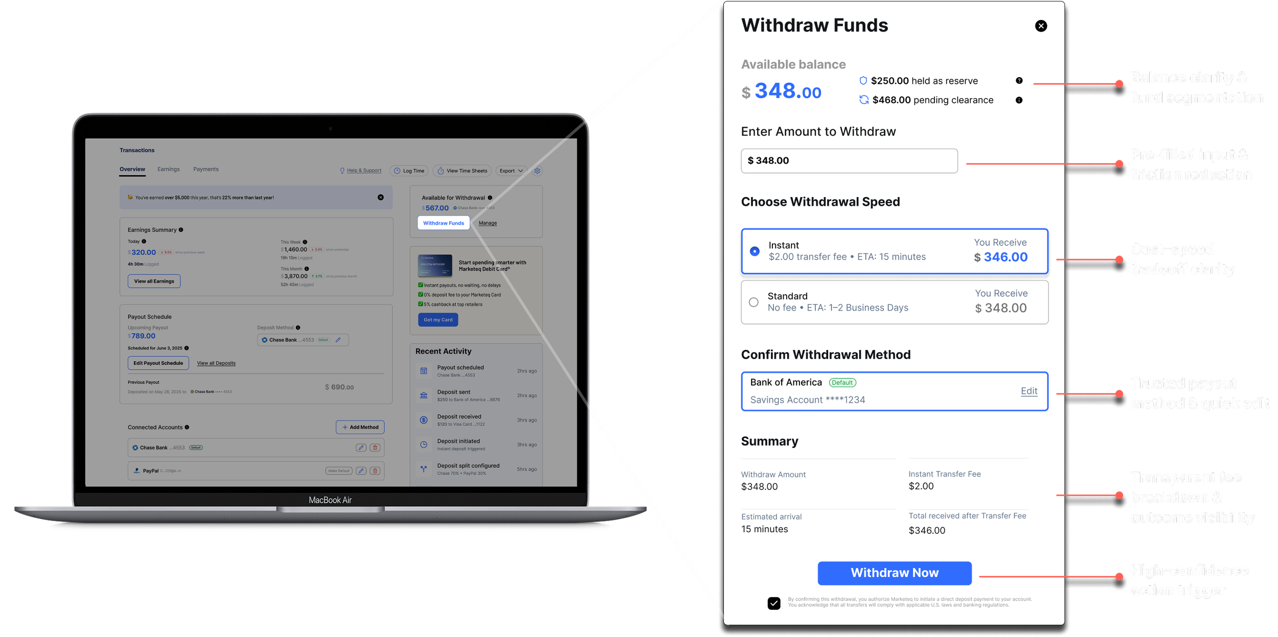
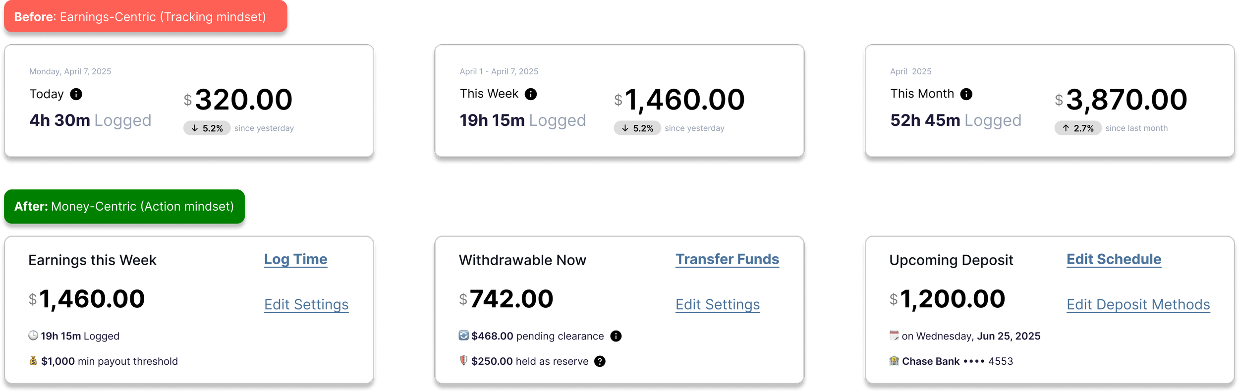
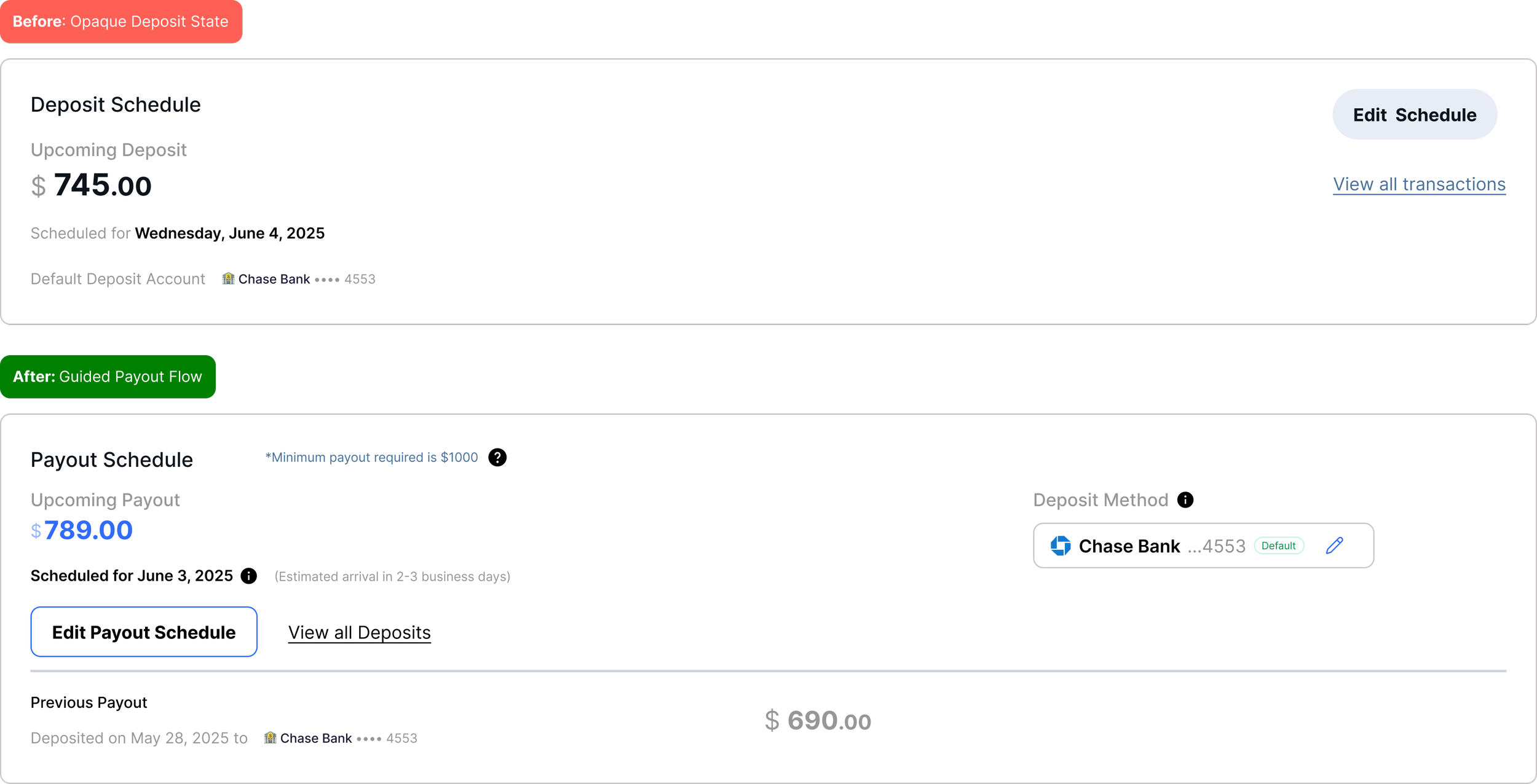
Each element answers a user's question before they feel safe to withdraw.Design Decision 2 - Shifting from tracking to action
KPI cards rewritten for financial clarity - withdrawable amount, upcoming deposit, and payout schedule shown at a glance.
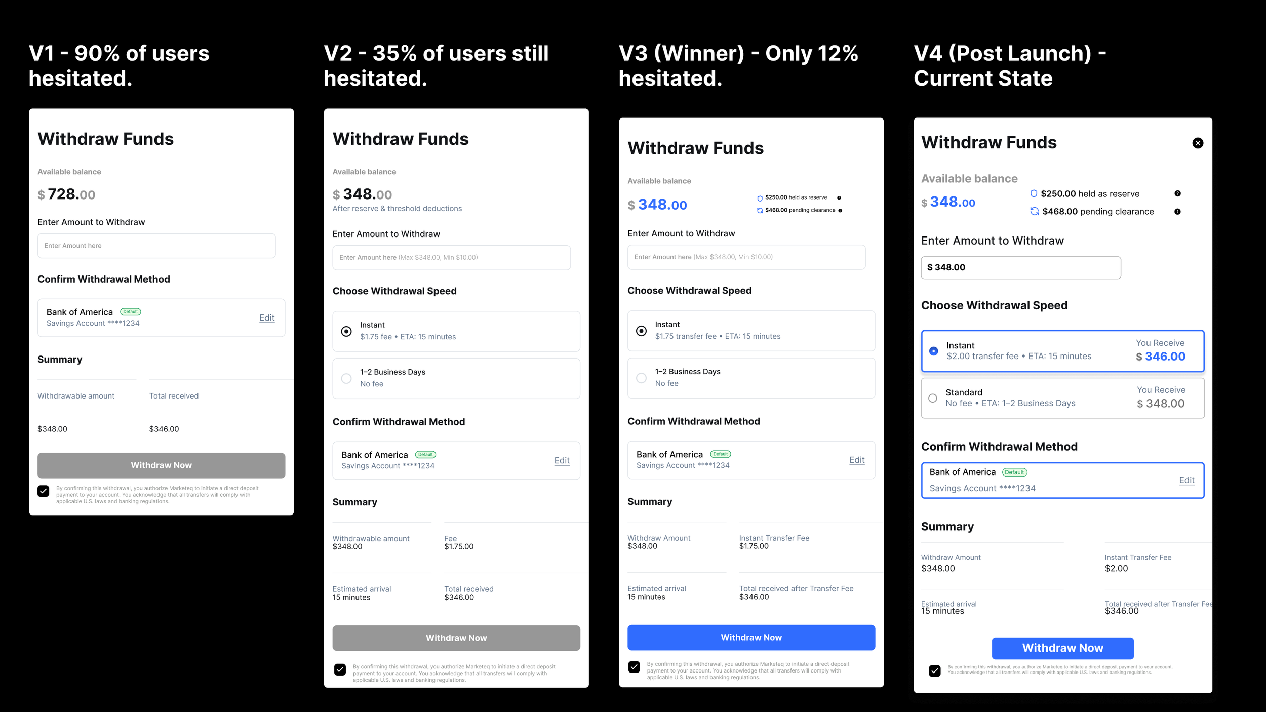
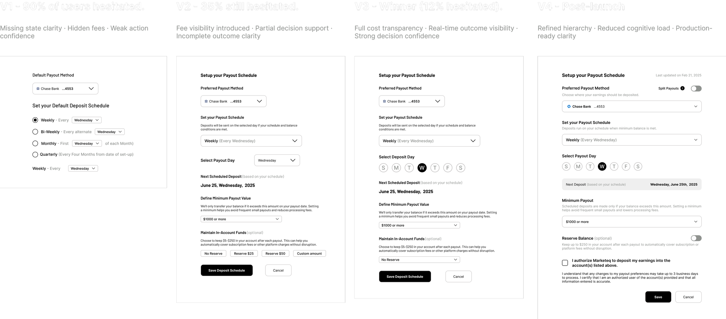
Design Decision 3 - Testing confidence
Four rounds. Three usability tests. Hesitation fell from 90% to 12% - each version fixed the biggest trust issue found previously.
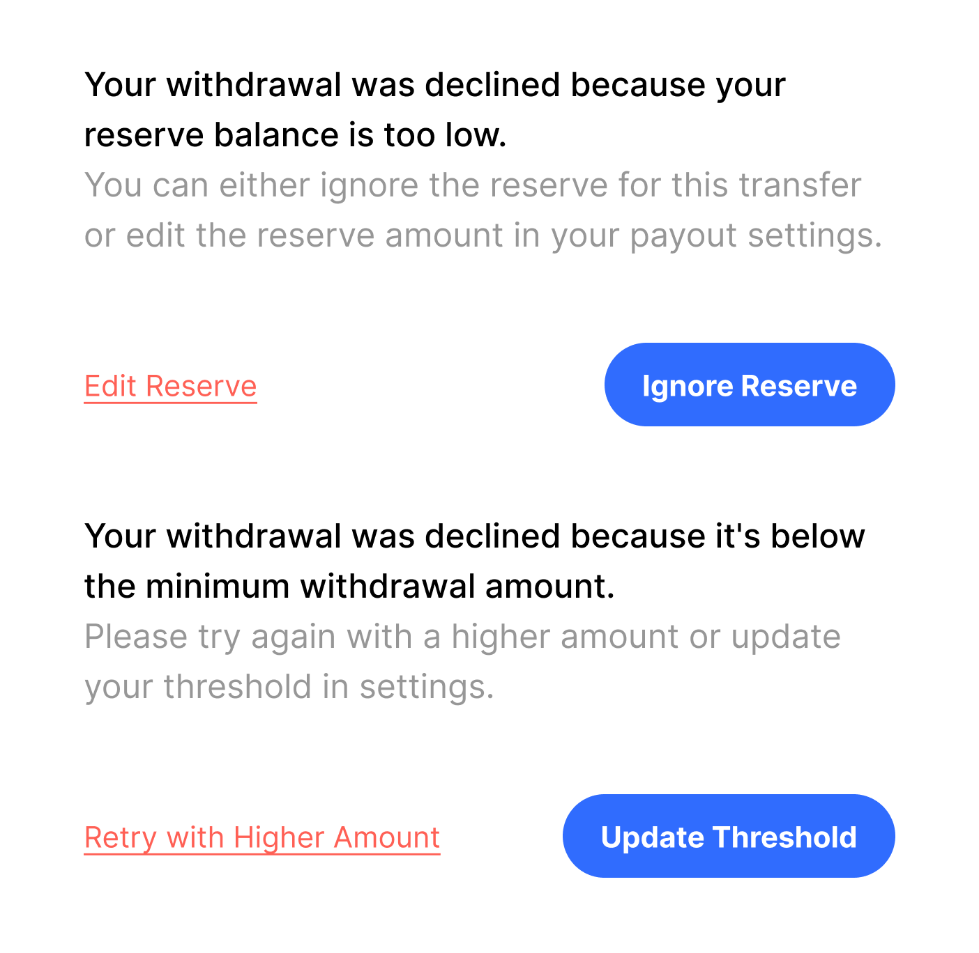
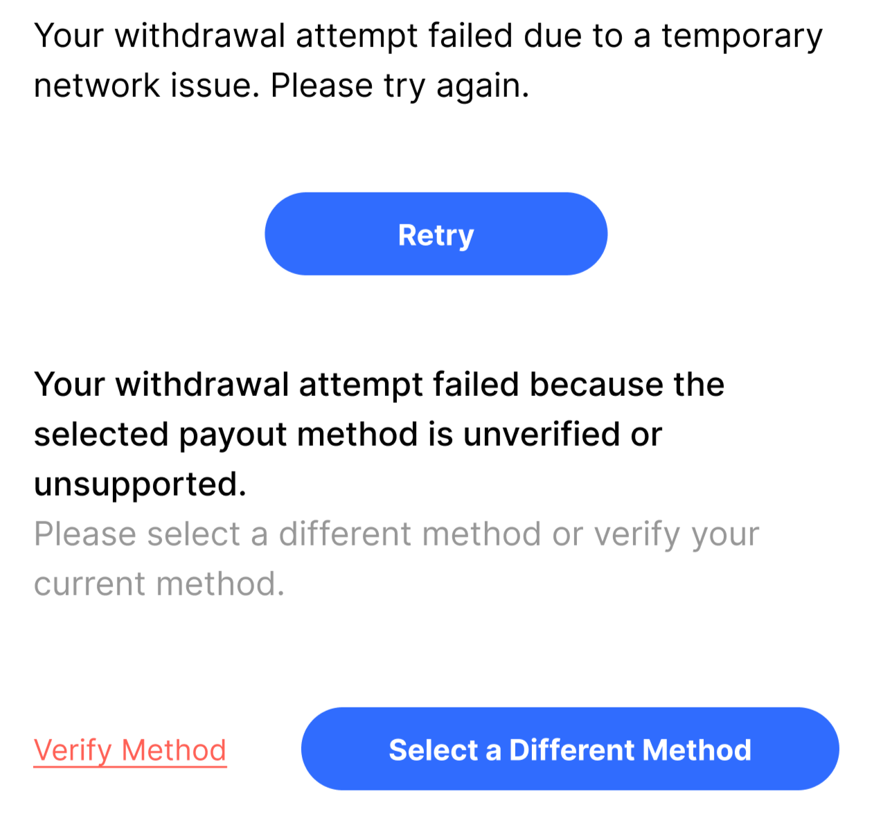
Design Decision 4 - Error states (Handling the 12% “What Ifs”)
After V3 cut hesitation to 12%, we fixed the remaining edge cases. Every error now has two ways to resolve it - no dead ends, no support tickets.
Payout setup
Design Decision 1: Redesigning the Payout Schedule screen
Show payout rules into clear, fixed inputs, set exact timing, thresholds, and outcomes so financial decisions aren’t ambiguous.
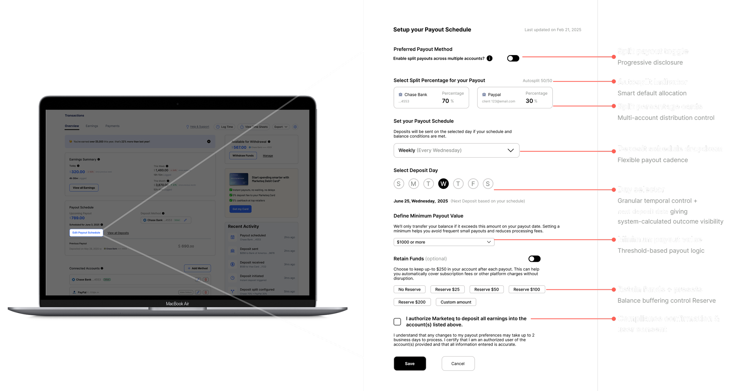
Design Decision 2: Guided payout visibility
Surfacing upcoming payouts, timing, and method to reinforce user trust and decision confidence.
Design Decision 3: Testing Confidence
Progressive payout disclosure, reveal timing, thresholds, or distribution only as user intent demands.
Final Product Screens
Withdrawal Prototype
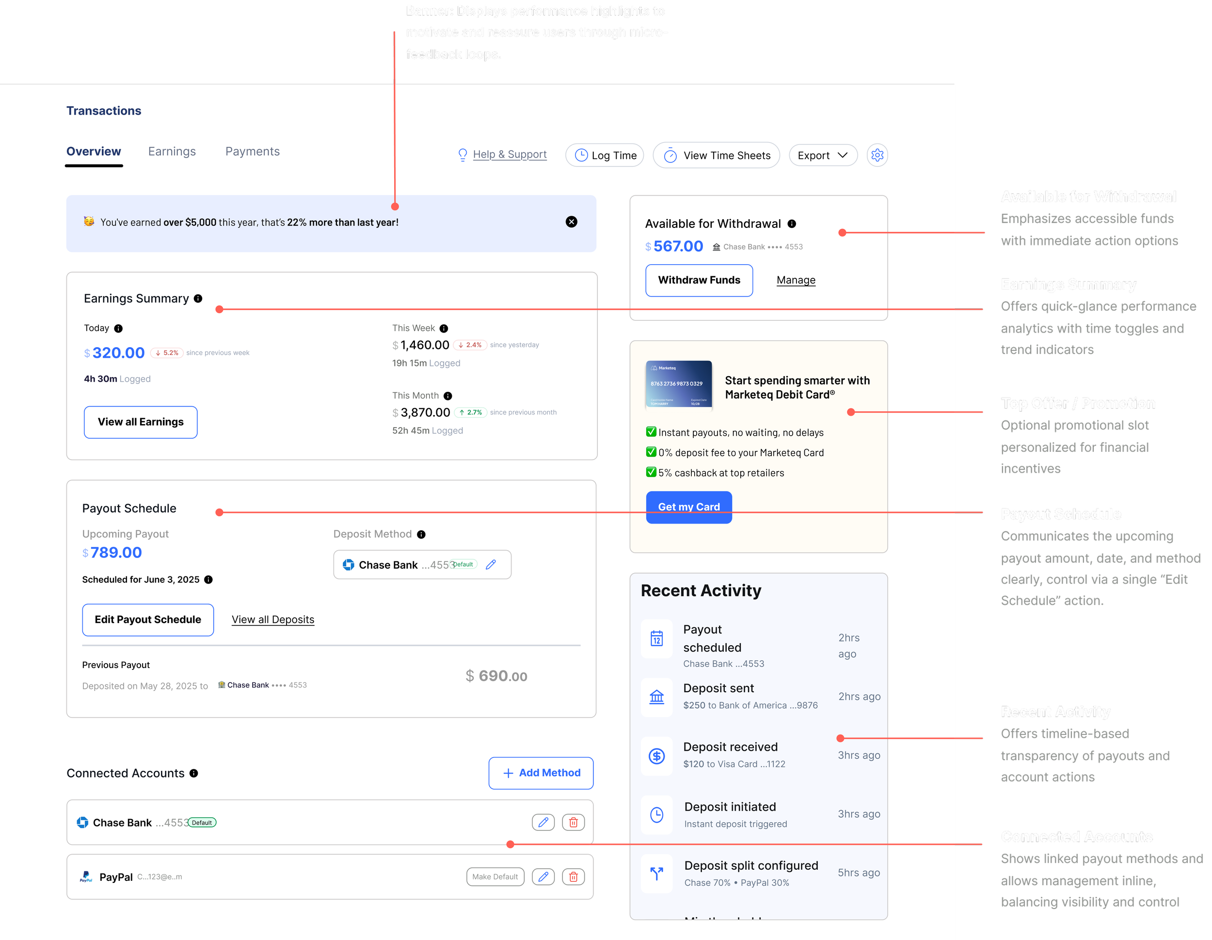
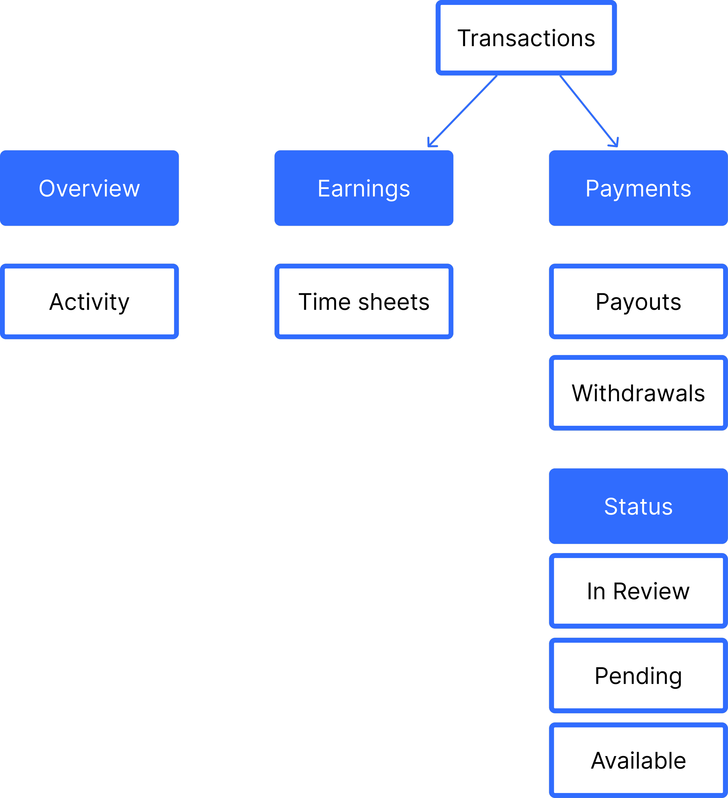
Freelancer Transactions Dashboard Overview
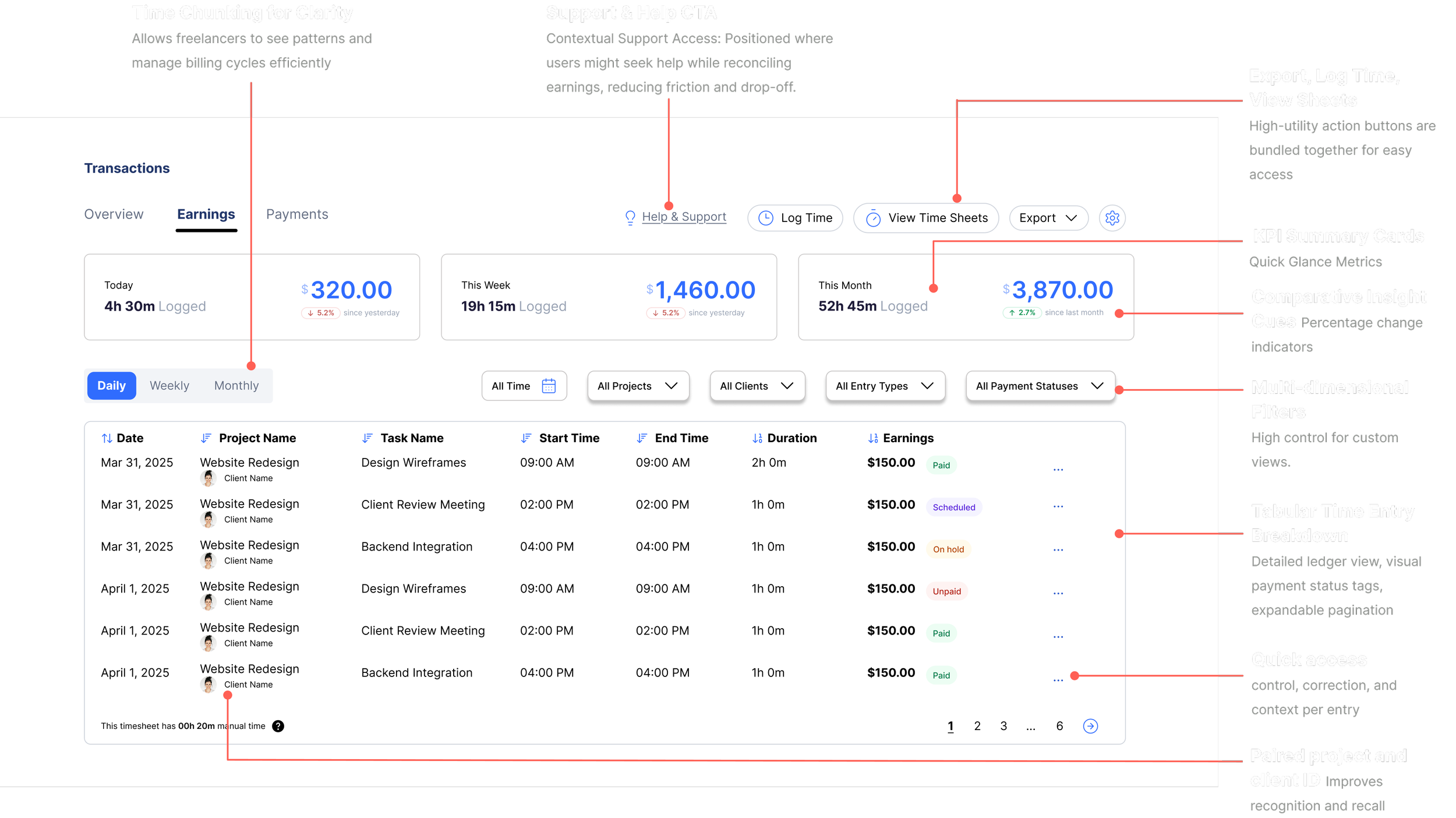
Freelancer Transactions Earnings
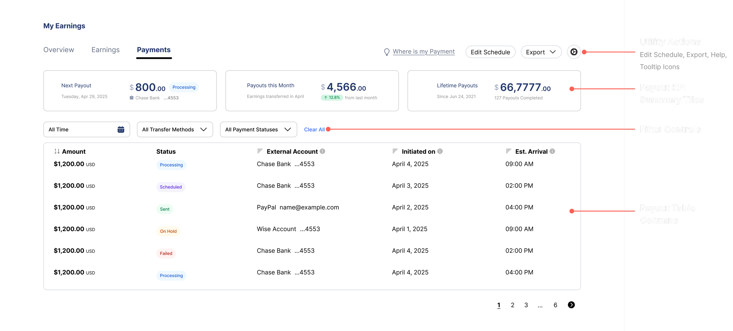
Freelancer Transactions Payments Ledger
Outcomes
▲ 40% increase
in withdrawal completion
▼ 90% → 12%
hesitation at point of withdrawal
▼ 35% drop
in "where's my money?" support tickets
User Testimonials

“I finally know exactly how much I’m getting and when. The whole payout process feels predictable now, I don’t have to second guess anything.”

“I don’t have to worry about whether payments will go through anymore.
Everything is clear, and I know freelancers will get paid on time.”
Marketeq Leadership

Christopher Torres, Founder & CEO, Marketeq Digital
“Vidhi brought a great level of care to everything she touched, from the earnings portal to the transactions system. She was thinking through every detailed step from multiple angles of the user journey, ensuring nothing was surface-level but rooted in deep logic.”
Personal Takeaways
Designing for financial UX reinforced one thing: clarity builds trust.
What started as a UI audit became a redesign of how users understand, control, and trust their money.
💡 What I Learned
Unclear outcomes = hesitation
Transparency is a design responsibility
Trust is built through predictability, not visuals
Real users expose system gaps, not just UI issues
Earnings UX requires timing, context, and control, not just balance visibility
🔮 What’s Next
Adaptive payout recommendations - optimized for speed, cost, or urgency
Outcome simulation - preview fees, arrival time, and method impact
Interruptible flows - save and resume payout actions
Financial summaries - exportable, structured breakdowns for reconciliation